數學函數可以用來做什么?
最基礎的當然是用來進行四則運算了,再進一步可以用來平方,對數,冪,絕對值,取余等,當然還可以用來計算三角函數。
靈活運用 CSS 中的數學函數,可以拋棄很多原本需要 JS 才能實現的布局場景。
calc()
最基礎的四則運算函數,對頭,就是用來做小學就學過的加、減、乘、除。
比如有這么一個需求:子元素占用寬度是父元素的一半多20像素!
這個需求,如果用常規的布局思路來看,父元素如果寬度固定 200px,還能簡單的算出來,子元素寬度是 120px。
但如果父元素的寬度不固定呢?還能計算出來嗎?如果沒有 calc 函數,那么唯一的辦法就只有拿出 40 米的 JS 大刀了~。
使用 calc 函數,就可以輕松解決這個問題:
.box {
  width: 100%;
}
.box .child {
  width: calc(50% + 20px);
}
注意:
加法(+)、減法(-) 運算符左右兩邊必須要有空格!原因是如果沒有空格字符串,-20px 是表示的負數,而不是減法。
除法中:除數(除號 / 右面的數)必須是一個數字(如:1,1.1,+2,-2.3,1e4),不能是帶有單位的值(如:2px,50%,3vw,2em)。與以前學過的除法一樣,0 不能作為除數!
乘法中:乘號(*)兩邊必須有一個數字。原因:calc(20px * 20px) 表示的像素平方,在瀏覽器中無法解析這種值!!
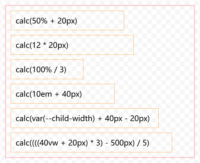
calc() 的各種使用方式:
<div class="box">
<div class="child">calc(50% + 20px)</div>
<div class="child">calc(12 * 20px)</div>
<div class="child">calc(100% / 3)</div>
<div class="child">calc(10em + 40px)</div>
<div class="child">calc(var(--child-width) + 40px - 20px)</div>
<div class="child">calc((((40vw + 20px) * 3) - 500px) / 5)</div>
</div>
<style>
.box {
margin: 20px 0;
width: 400px;
border: var(--base-border, 2px solid rgba(255, 71, 87,0.3));
}
.box .child {
margin: 10px;
border: 1px solid #ffa947;
padding: 10px;
}
.box .child:nth-of-type(1) {
width: calc(50% + 20px);
}
.box .child:nth-of-type(2) {
width: calc(12 * 20px);
}
.box .child:nth-of-type(3) {
width: calc(100% / 3);
}
.box .child:nth-of-type(4) {
width: calc(10em + 40px);
}
.box .child:nth-of-type(5) {
--child-width: 16vw;
width: calc(var(--child-width) + 40px - 20px);
}
.box .child:nth-of-type(6) {
width: calc((((40vw + 20px) * 3) - 500px) / 5);
}
</style>
效果:
min()
min() 用于獲取一組數值中的最小值。通常用于比較不同單位之間的最小值,比如 min(400px, 50%, 20em, 10vw)
使用示例:
<div class="box">
<div class="child">min(230px, 220px)</div>
<div class="child">min(50%, 220px)</div>
<div class="child">min(20vw, 20em, 1000px)</div>
<div class="child">min(var(--child-width), 100em, calc(100% * 0.85))</div>
</div>
<style>
.box {
margin: 20px 0;
width: 400px;
border: var(--base-border, 2px solid rgba(255, 71, 87,0.3));
}
.box .child {
margin: 10px;
border: 1px solid #ffa947;
padding: 10px;
}
.box .child:nth-of-type(1) {
width: min(230px, 220px);
}
.box .child:nth-of-type(2) {
width: min(50%, 220px);
}
.box .child:nth-of-type(3) {
width: min(20vw, 20em, 1000px);
}
.box .child:nth-of-type(4) {
--child-width: 26vw;
width: min(var(--child-width), 100em, calc(100% * 0.85));
}
</style>
效果:

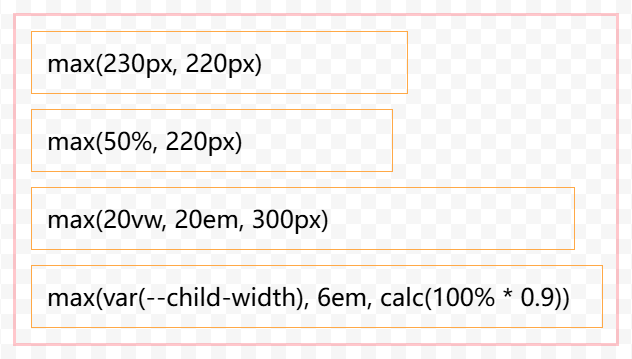
max()
max() 用于獲取一組數值中的最大值。與 min() 類似,作用相反取最大值,比如 max(400px, 50%, 20em, 10vw)
使用示例:
<div class="box">
<div class="child">max(230px, 220px)</div>
<div class="child">max(50%, 220px)</div>
<div class="child">max(20vw, 20em, 300px)</div>
<div class="child">max(var(--child-width), 6em, calc(100% * 0.9))</div>
</div>
<style>
.box {
margin: 20px 0;
width: 400px;
border: var(--base-border, 2px solid rgba(255, 71, 87,0.3));
}
.box .child {
margin: 10px;
border: 1px solid #ffa947;
padding: 10px;
}
.box .child:nth-of-type(1) {
width: max(230px, 220px);
}
.box .child:nth-of-type(2) {
width: max(50%, 220px);
}
.box .child:nth-of-type(3) {
width: max(20vw, 20em, 300px);
}
.box .child:nth-of-type(4) {
--child-width: 6vw;
width: max(var(--child-width), 6em, calc(100% * 0.9));
}
</style>
效果:
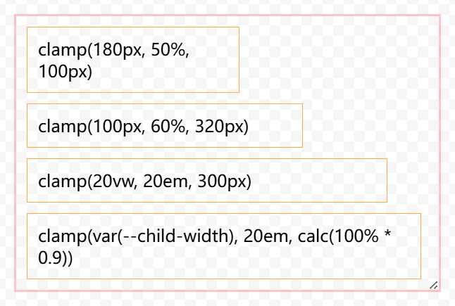
clamp()
此函數是 min() 和 max() 的結合體,可以同時指定最小值和最大值以及限定值,使用方式:clamp(min, value, max)。
比如 clamp(400px, 50%, 20em) 表示如果 50% 小于 400px,則取 400px,如果 50% 大于 20em,則取 20em,否則取 50%。
使用示例:
<div class="box">
<div class="child">clamp(180px, 50%, 100px)</div>
<div class="child">clamp(100px, 60%, 320px)</div>
<div class="child">clamp(20vw, 20em, 300px)</div>
<div class="child">clamp(var(--child-width), 20em, calc(100% * 0.9))</div>
</div>
<style>
.box {
margin: 20px 0;
width: 400px;
border: var(--base-border, 2px solid rgba(255, 71, 87,0.3));
resize: both;
overflow: auto;
}
.box .child {
margin: 10px;
border: 1px solid #ffa947;
padding: 10px;
}
.box .child:nth-of-type(1) {
width: clamp(180px, 50%, 100px);
}
.box .child:nth-of-type(2) {
width: clamp(100px, 60%, 320px);
}
.box .child:nth-of-type(3) {
width: clamp(10%, 20em, 90%);
}
.box .child:nth-of-type(4) {
--child-width: 6vw;
width: clamp(var(--child-width), 20em, calc(100% * 0.9));
}
</style>
效果:
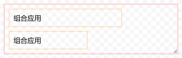
一個組合應用例子
<div class="box">
  <div class="child">組合應用</div>
  <div class="child">組合應用</div>
</div>
<style>
.box {
  margin: 20px 0;
  width: 400px;
  border: var(--base-border, 2px solid rgba(255, 71, 87,0.3));
  resize: both;
  overflow: auto;
}
.box .child {
  margin: 10px;
  border: 1px solid #ffa947;
  padding: 10px;
}
.box .child:nth-of-type(1) {
  --base-width: 10%;
  width: clamp(min(20px, 10rem), calc(var(--base-width) * 6), max(100%, 100vw));
}
.box .child:nth-of-type(2) {
  --base-width: 10%;
  width: clamp(min(20px, var(--base-width)), calc(min(var(--base-width) * 4, 300px)), max(calc(var(--base-width) * 9), 100vw));
}
</style>
可以看到上面例子中,clamp 函數可以嵌套 min、calc、max 函數,calc 函數也可以可以嵌套使用 min 函數,max 函數也可以使用 calc 的計算結果。
套娃一樣的用法,可以組合出各種復雜的運算場景!!
效果:
其他數學函數
對于 CSS 布局而言,四個基本的數學函數已經完全足夠了,但在一些 3D 和動畫場景中,您可能會用到一些其他數學運算函數,目前 CSS 支持的數學運算函數如下:
階躍值函數
round() 實驗性 根據舍入策略計算一個舍入的數字。
mod() 實驗性 計算一個數除以另一個數的模(與除數的符號相同)。
rem() 實驗性 計算一個數字除以另一個數字的余數(與被除數的符號相同)。
三角函數
sin() 計算一個數的三角函數正弦值。
cos() 計算一個數的三角函數余弦值。
tan() 計算一個數的三角函數正切值。
asin() 計算一個數的三角函數反正弦值。
acos() 計算一個數的三角函數反余弦值。
atan() 計算一個數的三角函數反正切值。
atan2() 計算平面內兩個數字的三角函數反正切值。
指數函數
pow() 計算基數的冪次方值。
sqrt() 計算一個數的平方根。
hypot() 計算其參數平方之和的平方根。
log() 計算一個數的對數值。
exp() 計算一個數的 e 次方值。
符號函數
abs() 實驗性 計算一個數的絕對值。
sign() 實驗性 計算一個數的符號值(正值或負值)。
對于高級運算函數有興趣可以參閱 MDN 文檔:https://developer.mozilla.org/zh-CN/docs/Web/CSS/CSS_Values_and_Units/CSS_Value_Functions
寫在最后
在響應式布局中,靈活運用數學函數,可以簡化很多不必要的代碼,也許您都可以放棄部分非必要的 媒體查詢 代碼。
?轉自https://www.cnblogs.com/linx/p/18863718
該文章在 2025/5/8 8:44:55 編輯過


 400 186 1886